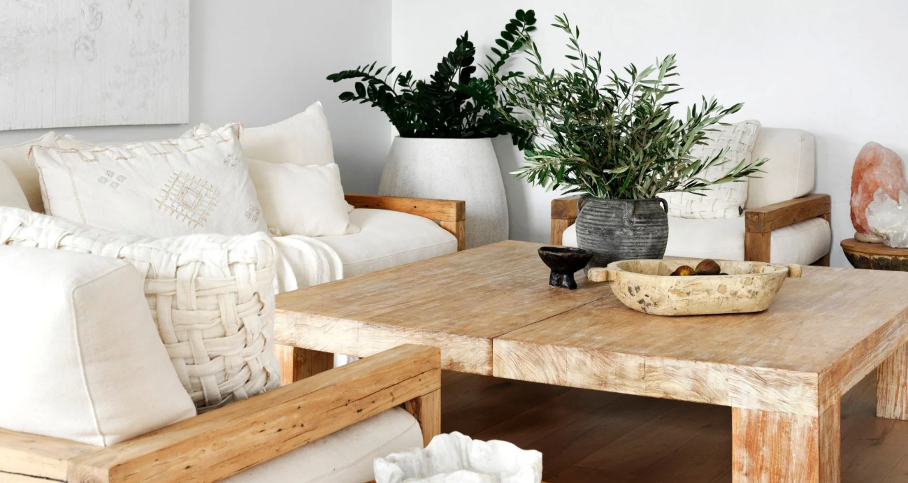
In the interior design industry, we often say: “Furniture is the skeleton, and accessories are the soul.”
You might have experienced this: being drawn to a beautifully crafted ceramic vase in a home goods store, or finding a charming brass candlestick at an antique market, and excitedly bringing it home. But once placed on your coffee table or sideboard , it suddenly “lacks presence.” It either looks dull or jarringly out of place. Even later, you might find a ring of indelible cup marks on your beloved walnut coffee table ; or fine scratches on the metal base of your marble console table.
The problem is never that you lack aesthetic sense, nor that the decorations are not exquisite enough.
The real key is that you’ve overlooked the “surface” itself.
Coffee table, sideboard, buffet, console, dining table… these are all “canvases” for displaying decorative items in your home. If the material of the canvas clashes with the properties of the decorations, even the most beautiful decorations will fail to achieve their intended effect.
When you truly understand the physical and textural characteristics of common furniture materials , you will know how to use “material contrast and complementarity” to create a seemingly casual yet sophisticated tabletop arrangement.
Below, we’ll discuss how to choose decorative items that perfectly complement different furniture materials.
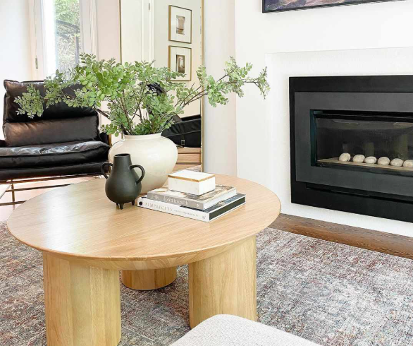
1. Solid wood tabletop (Walnut/Oak): Adding a sense of “lightness” to a sense of stability.
Solid wood is the most common material for coffee tables and sideboards in American homes, especially walnut, oak, and cherry wood. It is warm, absorbent, natural, and has rich textures.
1. Visual strategy: Introducing light and shadow and transparency
Dark solid wood, when paired with dark ceramics or wooden ornaments, can easily become a “visual dark block”.
Best Pairings: Glass and Crystal.
Placing a transparent glass vase, a crystal whiskey set, or a small but elegant glass sculpture on a walnut coffee table can instantly breathe life into the solid wood surface. The interplay of sunlight filtering through the glass and casting shadows on the wood grain is the most captivating moment for solid wood.
Secondary options: High-gloss
brass trays and sandblasted stainless steel candlesticks can both enhance brightness and “revitalize” the wood tones.
2. Avoidance Guide: Wood needs to “breathe” and also needs protection.
Solid wood is a “living material” that expands and contracts with changes in temperature and humidity.
Avoid using large, non-breathable coverings (such as PVC placemats).
Checking the bottom of ornaments for rough
, coarse ceramic or unpolished stone is a nightmare for a walnut coffee table.
wool felt pads to vases and sculptures to prevent slipping and protect the tabletop.
II. Marble/Travertine Stone Tabletops: Balancing “Coolness” with “Temperature”
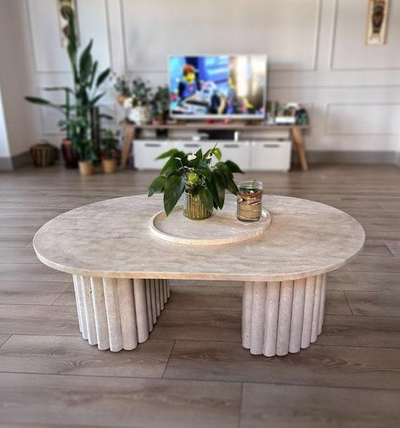
Marble coffee tables and travertine dining tables have become extremely popular in American homes in recent years. However, their hard lines and cold feel can easily make them appear distant.
1. Visual strategy: Enhance “warmth” and “tactile feel”
The key is to make the space more “human-centered”.
Best pairings: Wood and ceramics.
For example, place a wooden tray or a ceramic bowl with handcrafted marks on a white marble coffee table. The rough texture versus the smoothness of marble creates a sophisticated contrast.
Alternative option: Fabrics and books.
Coffee table books are a timeless classic in the American living room. Stacking 2-3 books instantly softens the tabletop.
2. Avoidance Guide: Stone is more “delicate” than you think.
Marble is a porous material that easily absorbs liquids and can cause chemical corrosion.
Avoid direct contact with acidic liquids such as lemon juice, red wine, and vinegar.
Essential oils must be placed on a metal or glass tray.
To prevent rust stains from forming on the wrought iron base (which are almost impossible to remove),
3. Glass or metal tabletops: Minimalist materials require a sense of “volume”.
Glass coffee tables or metal side tables are very “light” and have a weak visual presence.
1. Visual strategy: Increase weight and focus
The biggest problem with glass tables is that the ornaments appear to “float” and lack a center of gravity.
Best pairing: A large, substantial decorative piece,
such as:
Leather storage box
Sculpture with solid proportions
Solidly shaped pottery jar
Be bold with color!
Glass is transparent and colorless, so vibrant floral arrangements, metallic candlesticks, and modern art pieces can easily become the focal point.
2. Avoidance Guide: Prevent “head-on” collisions that could cause scratches.
Glass is susceptible to sharp scratches.
Metal is susceptible to wear and tear on coatings
velvet/cork base .
IV. Color Psychology: The Golden Ratio of Decorative Items and Furniture Materials
Finally, here’s a simple yet incredibly useful aesthetic rule of thumb:
Dark warm wood grain (Walnut/Cherry)
paired with brass, emerald green, and burgundy → Luxurious vintage
Light-colored, cool-toned wood grain (White Oak/Ash)
paired with white ceramics, Morandi gray-blue, and matte black → a sense of Nordic Japanese tranquility.
White/grey marble/quartz
is versatile, but it looks most sophisticated when paired with natural wood or caramel-colored leather.
Conclusion
Ornaments are never a competitor to furniture; rather, they are its “jewels.”
Next time you choose decorations for your coffee table or sideboard, try touching the surface first—feel its warmth, texture, and character. When you learn to respect the materials themselves, tabletop arrangement becomes more than just placing objects; it becomes a small-scale creation about light, touch, and a lifestyle.
May this guide help you awaken the neglected corners of your home and give every piece of your beloved decoration its own stage.