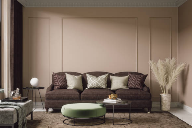
As the core area of a home, the color of the walls in the living room largely determines the overall style. To get rid of the monotonous white walls, try the following popular colors and matching techniques to make the space shine with unique charm.
1、 Popular color recommendations
Green series
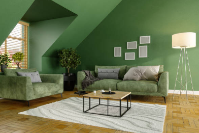
Green is a highly sought after color in recent years, which can inject natural vitality into the living room. The combination of grey green walls, wooden furniture, and white soft furnishings can create a fresh Nordic style; The combination of dark green walls with brass lighting fixtures or dark leather sofas can create a vintage sense of luxury. If you are concerned about the suppression of dark colors, you can use green locally, such as an accent wall, and balance the visual effect through light color transitions.
Neutral color
Neutral colors such as beige, light gray, and cream yellow are timeless classic choices. The beige wall paired with natural wooden furniture can create a warm and peaceful atmosphere; Light gray walls with black or dark wood accents can enhance the sense of spatial hierarchy. Neutral colors have strong inclusiveness, suitable for blending with multiple styles, and are not easily outdated.
Navy Blue and Black
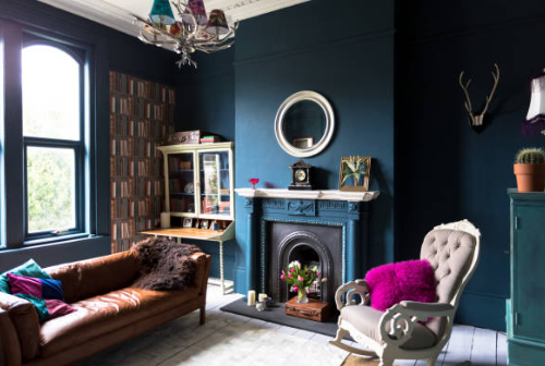
Deep tones such as navy blue or black can create a modern feel, but attention should be paid to matching. Navy blue walls can be paired with white or beige transitions to avoid darkening the space; Black walls are suitable for living rooms with abundant natural light, paired with light wood or metal decorations, which can neutralize dullness and create a fashionable industrial style.
Soft and bright colors
If you prefer bright colors, lime green, coral or ginger yellow are good choices. Lime green symbolizes nature, paired with green plants and light colored furniture, as if in a forest; Coral color is soft and peaceful, and when paired with beige, it can enhance the vitality of the space; Ginger yellow can create a warm atmosphere with Mediterranean style.
2、 Matching principles and techniques
The Golden Rule of Color
Follow the principle of “60% main color tone, 30% transition color, and 10% emphasis color”. For example, the green main wall is paired with a beige transition, and then embellished with bright colors such as pillows and decorative paintings, which can maintain harmony and add visual highlights.
Adjust colors according to space
Small unit: Choose light colors such as beige, light gray, or soft green, and pair them with light colored furniture to enhance the transparency of the space. Avoid using dark colors extensively to avoid appearing cramped.
Insufficient lighting: Prioritize choosing light warm colors such as cream yellow and light orange, or neutral colors such as light gray, and use color reflection to enhance the sense of light.
Adequate lighting: You can boldly try deep colors such as dark green and navy blue to create a sense of luxury through the contrast of light and dark.
The correspondence between material and color
Color matching should consider material texture. For example, gray green walls paired with velvet pillows or metal lighting fixtures can enhance the light luxury feel of the space; Wooden furniture paired with beige walls can enhance the natural and warm atmosphere.
Style coordination
The color should match the decoration style. Nordic style is suitable for fresh tones such as light green and beige; Retro style can choose low saturation gray green or quartz powder; Modern style can be decorated with black, white, and gray with bright colors.

3、 Precautions
Avoid color clutter: There should not be too many main tones in the same space, and it is recommended not to have more than three to avoid visual confusion.
Consider the influence of lighting: The color effect under natural light during the day may be different from that under night lighting, so it is best to observe under different lighting conditions when choosing.
Flexible adjustment of soft furnishings: If you are concerned about the color of the wall being too fixed, you can adjust it flexibly through soft furnishings (such as curtains, carpets, decorations), which reduces the cost of replacement.
Through reasonable color matching, the living room can become a space to showcase personality and taste. Whether it’s a fresh green color, a classic neutral color, or a bold dark color, the key is to combine spatial characteristics with personal preferences, allowing colors to add more beautiful experiences to life. Try these matching techniques to make your living room shine with unique charm!